Really enjoying the vintage design work found in Paul Malon’s Flickr photostream
Really enjoying the vintage design work found in Paul Malon’s Flickr photostream
One of my big design inspirations is the poster work of the Works Progress Administration (WPA); a "New Deal" agency formed by the US government in the 1930s to help end depression era unemployment.

The Library of Congress has a great searchable archive of close to 1000 WPA posters (500 of them are about not getting syphilis: good to know!).
Most of the posters feature bold abstracted designs and type typical of the modernisim that is associated with the Art Deco era. Despite the often semi-professional status of the artists who made them, they have come to have their own identifiable style. The posters are a lesson in simplicity, whilst maintaining personality.
You can see their direct influence in my own posters and cover artwork for Transformers: All Hail Megatron.
You may also be interested in my article on vintage concert poster design.
Aside from producing fabulous fonts, like those found in their latest Eames collection, House Industries make the most over-produced, over-the-top, yet beautiful print catalogs. They are one of my favourite design studios and I always look forward to seeing what they do next.


I’ve been admiring the work of NY based typographer, designer and illustrator Jessica Hische from afar for a while now, but last weekend whilst on a short visit to Melbourne I was excited to able to catch an exhibition of her excellent typography work in person. The exhibition was pretty small (let’s say bedroom–sized). But I really enjoyed geeking-out at her detailed lettering up close. There’s a definite retro-ness to her work (perhaps that should be “respect for typographic history”?) and it's super-playful.


I picked up a limited edition print which will be sure to get the framing treatment and go straight to the pool room.
One of the best and most consistent type foundries in the business, Hoefler & Frere-Jones, offer up some smart advice in their latest newsletter on how to combine up to 3, 4 or even 5 fonts effectively within the one design. I particularly like that they have given emotive descriptors for each of the example fonts: Tough, cheeky, sweet...

Of course, rules are made to be broken.
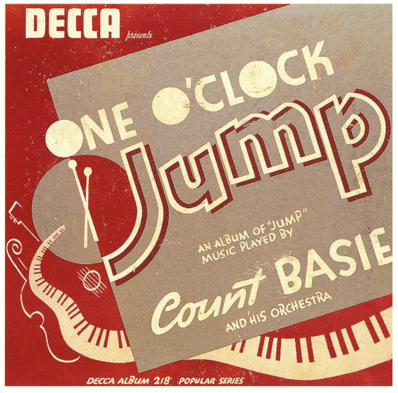
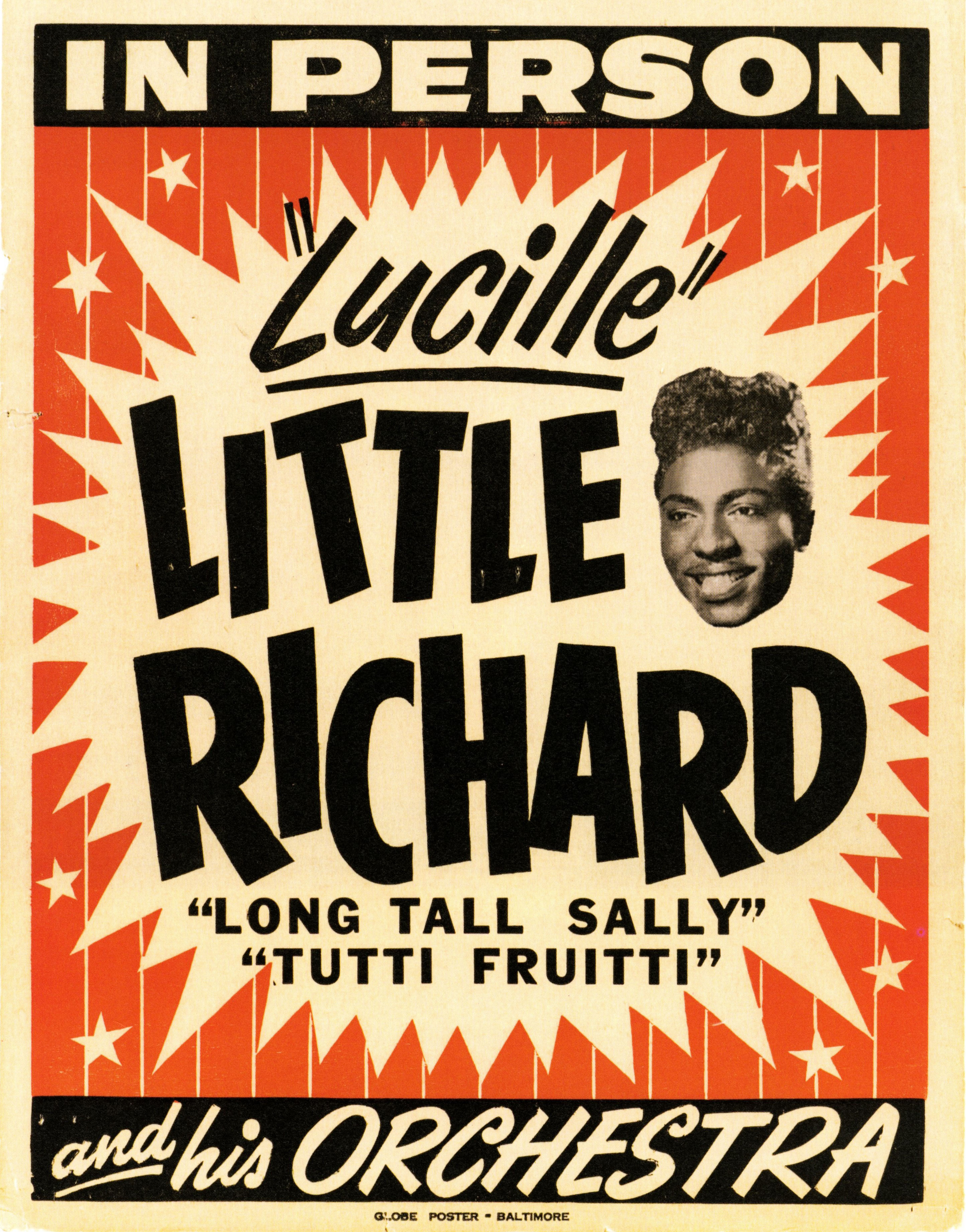
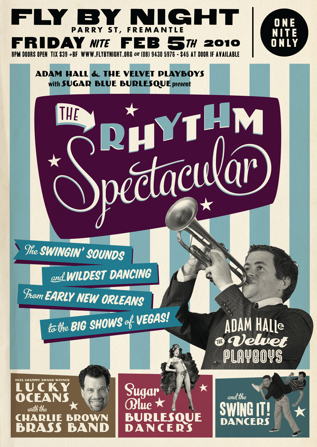
I’ve designed a few concert posters recently based on a vintage “tour blank” style of poster. But what is this style?

In the US from the 1920s to the 1960s, touring musicians commissioned eye-catching poster designs to promote their upcoming tours in a style shown in the examples below.


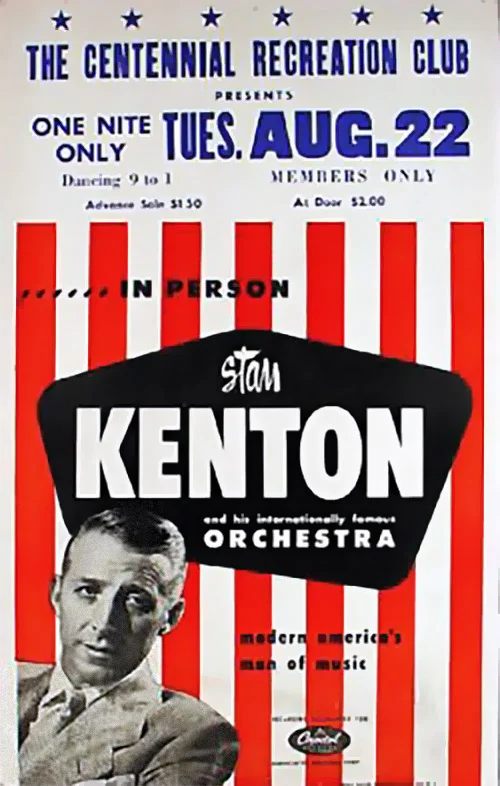
Determined to grab your attention, the designs were bold. Usually 2 or 3 bright colours were used along with arrows, circles, stars and stripes to direct the eye. As was the process of the day, the type was generally hand-lettered. Most of these designs used publicity photos of the artists, often using just their heads cut out from the background (alternatively, a caricature would be used).


It would have been expensive to produce a separate poster design for each of the destinations on their tour, so they would print a generic poster and leave a blank space (usually at the top) to add specific venue information at a later date. This venue information was printed (usually by letterpress) locally by the promoter. Sometimes the information was simply drawn on to each poster by hand. As a consequence the part with the venue information has a more amateurish appearance than the rest of the poster, which I tried to replicate with my modern interpretations.
I tried out some letterpress printing using wood type recently at the Melbourne Museum of Printing. I’ll go into more detail in a later post, but if you are a student of graphic design it is a visit I definitely recommend!
It’s worth noting that nowdays these “tour blank” concert posters are sometimes identified as “boxing style”.
Check out these posters advertising touring multi-act “revue” style shows! Now that’s a busy poster design! (but they sure look like fun concerts!)


Special thanks to Dr. Dennis Hickey for permission to use images from his fantastic poster collection. If you’d like to learn more check out his vintage concert poster collecting website. I also recommend Pete’s Poster Central site for more information on vintage tour blanks.